Case Journeys
Exploring intriguing stories and insights from around the world.
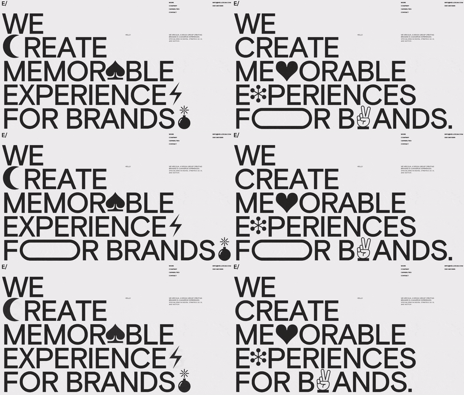
Typography That Speaks Volumes
Discover the art of typography and how it can transform your messages into powerful statements. Elevate your designs today!
The Art of Typography: How Fonts Influence Perception
The art of typography extends far beyond mere aesthetics; it plays a crucial role in shaping how information is perceived and understood. Different fonts evoke distinct emotional responses and can influence the reader's overall experience. For instance, serif fonts are often associated with tradition and reliability, making them ideal for print publications, while sans-serif fonts convey modernity and simplicity. This dichotomy highlights the importance of selecting the right typeface to ensure that the message aligns with the intended perception. A well-chosen font can enhance readability, guide the reader's attention, and elicit the desired emotional reaction.
Moreover, the use of typographic hierarchy is vital in design, as it helps to organize content and emphasize key information. By varying font sizes, weights, and styles, designers can create a visual roadmap for readers. For example, headlines in bold, larger fonts draw attention first, while subheadings and body text provide structure and clarity. This strategic use of typography not only improves user engagement but also reinforces brand identity. In an age where first impressions matter significantly, mastering the art of typography is essential for communicating effectively and leaving a lasting impact on the audience.

Choosing the Right Typeface: Tips for Your Design Projects
When it comes to choosing the right typeface for your design projects, consider the overall message you want to convey. A typeface can evoke certain emotions and set the tone for your content. For instance, serif typefaces such as Times New Roman are often associated with tradition and reliability, making them ideal for formal documents. In contrast, sans-serif typefaces like Arial or Helvetica provide a modern and clean look, perfect for tech-centric brands. Keep in mind the user experience; readability is crucial, especially on digital platforms. Choosing a typeface that aligns with your brand’s personality while being easy to read will enhance your audience's engagement.
Another key factor in selecting a typeface is versatility. A good typeface should work across various formats—whether it's for print, web, or mobile applications. Consider creating a typographic hierarchy by choosing a combination of typefaces that complement each other. For example, pairing a bold headline typeface with a lighter body typeface can provide a visually appealing contrast. Additionally, ensure that the chosen typeface reflects your brand identity by testing it in different contexts. Utilize tools that allow you to visualize your text in different environments to find that perfect match.
Why Typography Matters: The Psychology Behind Font Choices
Typography is more than just the art of arranging type; it plays a crucial role in how we communicate and perceive information. Different font choices can evoke various emotional responses and shape the reader's understanding of content. For example, a clean, sans-serif font like Arial may convey modernity and simplicity, while a serif font like Times New Roman often embodies tradition and seriousness. The psychology behind these font choices can significantly impact user engagement and retention, making it essential for bloggers and content creators to consider their typography carefully.
Furthermore, the psychological effects of typography extend beyond mere aesthetics. Studies have shown that certain fonts can enhance readability, aiding in comprehension and reducing cognitive load. Consider using a readable font for body text, such as Georgia or Verdana, to ensure your audience can easily digest your message. In contrast, decorative fonts can be effective in headers or calls to action, where grabbing attention is paramount. Ultimately, thoughtful font selection not only improves the visual appeal of your blog but also enhances user experience and influences how your audience perceives your content.